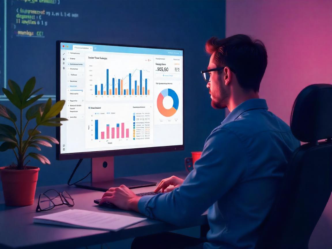
Why Static Dashboards No Longer Cut It
In the year 2025, real time data is no longer a luxury but a requirement. Whether it is fintech startups or health analytics teams, decision-makers are looking to have a more interactive and quicker means to visualize and operate on their data. However, the vast majority of enterprises are stuck on stagnant Excel reports or slow BI systems that cannot keep up with the pace of knowledge. The divide between the technical data and non technical stakeholders is continually increasing.
Streamlit and Plotly Dash enter there. These two frameworks (both powered by Python) are changing the way we create data dashboards – transforming code into interactable, sharable, and living breathing visual tools in a few lines. And the greatest thing is? It is not required that you be a JavaScript ninja or a UX designer to use them.
Streamlit vs. Plotly Dash: Choose the Right Tool for Your Story
Streamlit and Dash can be easily put in the same bucket. What is more, they both assist Python developers in developing web-based dashboards. Nevertheless, their philosophies are subtly, and significantly, different.
Streamlit is a data scientist sketchbook. It is easy to use, simple, and allows you to deploy Jupyter notebook to live dashboard in minutes. Have to see model outputs or create simple internal applications? Streamlit excels in this. However, Dash is the Swiss Army knife. Plotly made it; moreover, you can use it with full-blown applications, page navigation, customizable components, and REST API.
A quick sid-by-side:
Streamlit:
- Most suitable to quick prototyping
- Allows use of custom components using JavaScript when required
- Massively famous with ML engineers (employed by Snowflake, Hugging Face)
- Streamlit Cloud free hosting
Plotly Dash:
- Built to be production grade apps
- Fine-grained control over layout and UI behaviour
- Clients of McKinsey, NASA, and Capital One have used it as a client-facing tool
Authenticated enterprise deployment
I once worked as a data consultant with a startup that had to visualise customer churn in real-time. Streamlit was used to prototype in hours. However as we grew to hundreds of users Dash has become a requirement to manage modularity and complexity of the UI.
From Notebook to Dashboard: A Developer’s Shortcut
The beauty of Streamlit and Dash is in simplicity. Using a few lines of Python, one can transform static pandas data into interactive web applications.
Here’s a mini Streamlit example:
import streamlit as st
import pandas as pd
import matplotlib.pyplot as plt
df = pd.read_csv(“sales_data.csv”)
st.title(“Sales Dashboard”)
category = st.selectbox(“Select Category”, df[“category”].unique())
filtered = df[df[“category”] == category]
st.line_chart(filtered[“revenue”])
Compare that with Dash’s slightly more modular structure:
from dash import Dash, html, dcc
import plotly.express as px
app = Dash(name)
fig = px.line(df[df[“category”] == “Electronics”], x=”date”, y=”revenue”)
app.layout = html.Div([
html.H1(“Sales Dashboard”),
dcc.Graph(figure=fig)
])
In both cases, you’re replacing static CSV reports with web-based visual tools. But with Streamlit, your experimentation feels faster. Dash, however, starts paying off when your team grows or your app gets complex.
Real-Time Interactivity: The Game-Changer
Interactivity is not a gimmick, it is the means to the engagement. In a survey conducted by Forrester in 2024, firms employing interactive dashboards experienced insight-to-decision cycles 28 percent faster than the traditional approaches. That is to say, the fact that the data is clickable, filterable is not only a prettification, but it produces business value.
How about a realistic scenario? A biotech company I consulted was finding it hard to map clinical trial results in various geographical locations. We built a dashboard in Streamlit that included region filters, patient status sliders, as well as a live chart updater that was connected to their PostgreSQL database. In under a week, execs could have a tool that would provide them with live trial results without using SQL queries or PDFs.
Using Dash, the same dashboard might be extended afterward with:
- Various tabs by stages of the trial.
- Interactive choropleth maps
- Access control based on Role of various stakeholders.
Here’s what users loved most:
- High speed reactiveness (with local caching and session states)
- The possibility to send links with the pre-filtered results.
- Zero learning curve on non technical users.
These dashboards were not mere reporting tools but they turned out to be decision hubs.
Going Live: Hosting, Security, and Scaling
Dashboard building is one thing. It is one thing to implement it in a place where you or your clients can rely on it.
- Streamlit Cloud is a deployment system that is integrated with GitHub. Press to your repo, and your app is immediately updated. However, to deploy enterprise-level, you might prefer to employ AWS EC2 using HTTPS plus custom domains.
- Dash apps may be deployed to Heroku or Render, or more complexly with Flask servers. Dash Enterprise includes role-based access, CI/CD pipelines, and Kubernetes Scaling.
Security Tip: Both frameworks allow for session-level user control, but for anything involving sensitive data, use token authentication or embed dashboards inside internal apps behind login walls.
Conclusion: Your Data Deserves a Voice
It is an era of decreasing attention span and an age of growing data. Dashboards must not only be informative — they must also stimulate inquisitiveness, aid in decision-making, and support narrative.
Streamlit and Dash are different but equivalent gateways to achieving that. You can be a single data scientist trying to meet a deadline with a prototype, or you can be an engineer on a team of 10 or 100 trying to deliver analytics tools to 10,000 users: these frameworks will serve you well.
And here comes my personal thought: Python hascie made data storytelling democratic than ever. You do not have to learn React or D3 to animation your data. You only have to think in an interactive way, and write the code accordingly.
What and your next dashboard?
Build it. Share it. Allow your data to speak.